Brand Elephants - Thank You Box

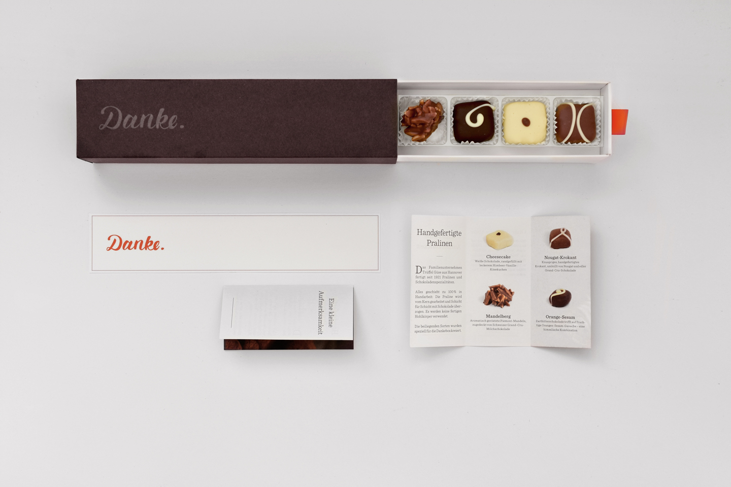
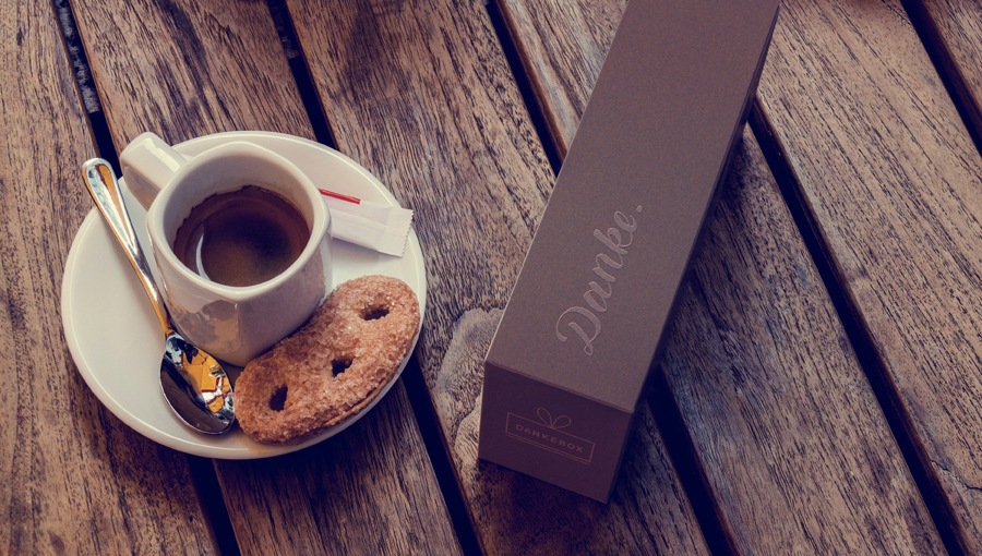
Give joy. Dankebox sweetens the day, with small fine gifts from selected manufactures. It offers a comprehensive service in the area of corporate gifts. The Thank You Box is a high-quality folding box consisting of an inner part, variable inserts and a high-quality slipcase made of brown through-dyed cardboard refined with copper foil hot print and embossing. The elegant box also comes with a thank you card that lifts up slightly after opening for easy removal.
g.tec - exclusive knife & presentation packaging


An unusual packaging that lets the knife float inside the box. The knife is balanced on a small plastic foot. It floats in the packaging. The packaging is used here for storage and presentation of the contents. In order to present the high-quality packaging and your exclusive knife in a fitting manner, we have chosen a material combination of cardboard and Plexiglas. The lower part is made of black Plexiglas with a silky-smooth sheen. The upper part is made of high-quality cellulose cardboard with a velvety soft surface. The printing on the lid is done with special inks that are raised, similar to embossing. The aim of the luxurious presentation packaging was to set the scene for the extraordinary contents.

Unicorn Packaging / HighEnd Electronic Packaging / Brainwave Measurement


The first product of the company g.tec, which is sold directly to end customers. The aim was to design packaging that graphically depicts or explains the essential function of the product and places it in a modern/start-up context. In addition, it was important to design a variable packaging in which the components could also be shipped individually. The solution was a box-in-box variant.
The inner boxes are also used for shipping spare parts or allow subsequent changes to accommodate/represent different products or system variants. The inserts of the inner parts are as a separate part and thus these inner boxes can be easily adapted to the contents. This outer box has a carrying handle. This makes the product/packaging easy and practical to handle. The packaging itself is made of kraft cardboard which is also laminated onto corrugated cardboard. The colour is printed in a special process so that the luminosity of the colours on the brown coloured cardboard really comes into its own. It also creates a very interesting tension between the raw, rough material and the bright, shiny neon colour.
colour.
Graphic:
John Gautier
Packaging design:
Herwig Bishop
Bia Laura - exclusive handmade round packaging for decorative items


A round packaging box like from the old days. A round packaging made with the highest precision craftsmanship. Made from materials that celebrate the country and its people, their values and craftsmanship. The packaging consists of a combination of grey cardboard, high-quality printing and a leather closure that also functions as a carrying handle. A robust leather strap is connected to the packaging by buttons and closes this round packaging.
The packaging provides an attractive and externally visible frame for the traditional contents. Inside, there are high-quality handcrafted decorative objects with an Alpine scene such as an alpine procession.
The target group includes Japanese tourists who want to take a piece of Switzerland back home with them. This should also be visible and tangible through the packaging. From the look to the haptic properties to the depiction of the lokael mountain ranges and the shape of the round packaging.
Graphic:
John Gautier
Packaging design:
Herwig Bishop
Huber Suhner l High End Packaging l Packaging for cables
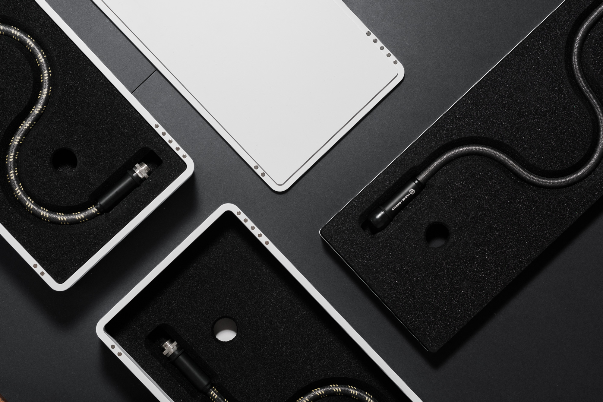


A PremiumCase packaging for high-end cables. The packaging is made of a plastic case which can be milled or deep-drawn into shape from high-quality polycarbonate. Polycarbonate was chosen because it is not a disposable packaging. This material is very resistant and impact resistant. Two different types of packaging were developed. One with a separate lid, which is fixed by a magnet. In the second version, the lid was connected to the bottom part. The opening mechanism was very simply integrated into the lower part of the case. The content itself was made of a very high-quality fine-pored foam insert. In order to pack the different cable sizes in a visually appealing way in one packaging size, we worked with different graphic schemes for the cables. We had to make sure that the cable did not fall below a certain bending radius. So that the quality of the cable is not impaired.
Product design:
Johannes Gautier, Herwig Bischof
Ernest - The New Egg Pack


Design, development and construction of a new egg packaging. We asked ourselves the question, "how do we achieve differentiation in a mass market when one product is literally like another? "The answer is Ernest. Ernest manages to change the consumer's perception without having to change the product itself. Ernest gives room for new product ideas around the egg theme and creates a high level of recognition among consumers.
Graphic:
John Gautier
Packaging design:
Herwig Bishop
Legart Forschungsatelier - Packaging for cosmetics line Ambuja

 Only the best & most exclusive ingredients are good enough for Ambuja's cosmetics line. So it was clear to pay attention to a high-quality design for the packaging as well. After a long development period, we are very proud of the first trade fair reactions we received to the packaging line we developed at the Elements Showcase in New York. The idea was to design a package that opens over the edge and then unfolds into a flower shape to reveal the precious contents.This was made possible by a sophisticated folding mechanism. The packaging can be opened over this very edge and presented at the POS in a half-open state. In this position, you get a glimpse of the product and this arouses curiosity. You want to take the product in your hand to see what is inside. Once in your hand, you don't want to give up the packaging. The velvety surface and the sophisticated mechanism do their part.
Graphic and product design:
John Gautier, Herwig Bischof


 I would also like to receive something like that as a gift! These were the reactions to the first packaging samples we created by hand. What was important to us? To create a strong connection to the Bregenzerwald region, where people are independent and stubborn. A region where handicraft is very important. A region where tradition is lived and preserved. In short, a piece of Bregenzerwald to take home. The Bregenzerwald is reflected in every element of the packaging. The material looks natural and genuine, like the land and its people. Folding, punching, embossing, patterns convey the high level of craftsmanship in the Bregenzerwald, which has always been an important part of life in the region. Moreover, each of these elements also has its function. The packaging gives a glimpse of the contents through its cut-outs, the folds provide stability, the loop fixes a wide variety of cheese sizes in the packaging, making the packaging variable in use.
Packaging design:
John Gautier
Herwig Bishop
Capo - hat packing


 It should be highly functional, the new Capo hat packaging. One packaging size for all Capo hat shapes and sizes. It should radiate high quality and also be space-saving to store. The solution developed is classic in form and functional in design thanks to the sophisticated holding and closing mechanism. The packaging is made in 2 parts and has a beautiful carrying handle in the form of a felt loop. The packaging can be folded completely flat, which saves space compared to conventional solutions.
Packaging design:
John Gautier
Herwig Bishop
Boy with ideas - Schlachters packaging for schnapps / noble distillate Tentation


 The Schlachter company on Lake Constance gave us the task of designing packaging for their high-quality distillate "Tentation". Our goal was to convey the craft of distilling and the dedication with which the exquisite apples are pulled and processed through the packaging. We found the solution in a packaging that feels like a block of wood and lets the precious contents glow in different shades from yellow to gold, depending on the incidence of light. The result is a three-part packaging that makes you recognise and feel the work and passion that went into making this valuable product. The block-shaped inner part made of corrugated cardboard does not need hinges thanks to a special construction. The solid design of the block made of corrugated board makes it possible to reduce the size of the packaging very much and to do justice to the elegant shape of the bottle without having to forego the necessary protective function. The packaging is closed by a wooden pin made of maple wood which is inserted at the side and is optimally held in the packaging by the back tension of the corrugated board. Finally, an open top cover is slid over the inner part. This makes it easy to remove the inner part. A wooden structure is printed on the cover, which emphasises the natural character of the contents through its roughness.
Project partners:
Moritz Kempf - Boy with Ideas ( Project Manager )
Sven Hiemer - Seven Grafik ( Graphic )
Manuel Kallina - Kallina KD ( Graphic )
Packaging design:
Herwig Bischof ( b.packaging )
IE AG l Packaging for commemorative objects


It should be a sacred form that is in harmony with space and time. The packaging is made of one piece of wood, turned. It consists of 3 wooden parts: the bottom/lid and a double bottom that becomes a secret compartment for personal items. The packaging itself serves both to store the memorial object and to present it.
It is available both raw as nature and lacquered, glazed, depending on the wishes of the bereaved. Through the way the product is presented, the packaging becomes a shrine that creates a space for remembrance.
Product design:
Johannes Gautier, Herwig Bischof
Art Bodensee - Mailing Kurvert & Folder in One

 For this year's Art Bodensee we were asked to design an envelope for the invitation to this year's fair. The idea was to develop an envelope that functions both as a folder and presents the contents clearly. The folder can also be used variably for other themes via the printing and can be folded or inserted into the desired envelope by means of a simple mechanism.
Graphic:
Karoline Mühlburger ( kaleido )
Packaging design:
Herwig Bischof ( b.packaging )
Legart Research Studio - Image Folder


 We designed an exclusive and variable product folder for the Legart Research Studio. The idea behind it was to offer the customer new flexibility in customer meetings through product set cards. The set cards enable Legart to respond quickly and easily to customer needs and product innovations. As a form, the essential design element of the company logo - the hexagon - was integrated into the construction of the folder. The hexagon serves as a design element and at the same time it is given the function of the removal compartment. The compartment for the set cards also contains a clasp. The clasp has the task of fixing and centring one or more cards in the compartment.
Packaging design:
John Gautier ( Gautier )
Herwig Bischof ( b.packaging )
Nord Süd Verlag - Postcard set

 We had the task of designing a set of postcards for Nord Süd Verlag from Zurich. The idea was to design something playful and colourful that conveys the values and identity of the children's book publisher. In addition, it should be easy to handle and clear. The postcard set consists of two parts. The first part consists of a cardboard punch that can be folded into a small booklet. Two postcards can be inserted into this booklet on each side. The different colouring of the edge creates a very beautiful play of colours that takes up the colourfulness of the content and transports it to the outside. The title page is embossed to enhance the tactile experience of the combination of materials. The booklet is enclosed by a simple ribbon with a map prominently displayed on the front. On the back is a reduced representation of the entire contents. This gives the end customer a good overview of the contents without having to open the postcard set.
Graphic:
Silvia Keckeis ( kaleido )
Packaging design:
Herwig Bischof ( b.packaging )
Barta - Packaging for traditional shirt

 Traditional costumes are enjoying great popularity again. Men and women wear traditional costumes, and not only for traditional occasions. A reason for Manfred Barta to deal with this topic. The result is the T-shirt in traditional costume look. The comfort of a shirt combined with the look of traditional costume. As a gag for a tent festival or as a souvenir from a holiday, the traditional costume shirt delights young and old. Our task was to package this traditional T-shirt in a functional and appealing way. It is sold through hoteliers, souvenir shops and online shops. The aim was for the packaging to explain the product simply and quickly and to make it easily visible at the POS. We achieved this with a folding package on which the traditional costume shirt is printed 1 to 1. The product can be hung up on a separate hanger made of cardboard in a natural look. The product is also labelled via the loop, which prevents confusion and creates a clear distinction from the classic traditional costume. The packaging itself was designed as a reversible pack, which means that there is one packaging for two differently printed shirts. This saves costs, protects the environment and gives the customer flexibility. In addition, the customer / presentee is informed when unpacking which colour variant of the traditional costume shirt is still available.
Graphic:
Manfred Barta ( webXpress )
Packaging design:
Herwig Bischof ( b.packaging )
Skinpharma - Packaging for cosmetics KTK Skincare

 KTK Skincare stands for cell activation based on the patented active ingredient NADH. This is obtained naturally from yeast and acts like an igniter for the cell. We were asked to design the packaging for this high-quality and natural product. The focus of the concept was to achieve a high level of recognition at the POS and to convey the values of the product. The packaging is made of two parts. These parts are made of different cardboard materials. The bottom part is rough and in a natural colour. The upper part is also made of cardboard but is velvety soft and bright white. It thus creates a field of tension in relation to the consumer's perception of stimuli and optimally conveys the function of the cosmetics. Cell-activating, firming ... The basic element "the cell" is also incorporated abstractly into the shape of the packaging, both in the upper and lower part of the packaging. As already mentioned, the packaging consists of two parts. The lower parts of the respective packaging sizes are identical, which enables simple and cost-effective production for different pack sizes. A simple differentiation in case of an extension of the product series is easily and economically possible by using differently coloured bottom parts. A flexible packaging system that enables a high level of recognition, conveys the values and is easy to produce or expand.
Graphic:
Karoline Mühlburger ( kaleido )
Michale Marte ( kaleido )
Packaging design:
Herwig Bischof ( b.packaging )
Amann - Packaging for hairdressing scissors

 Japan, a country where the traditional craftsmanship of knife and scissor making has been passed down for generations and is still practised in its most original form. The result is high-quality knives and scissors that are of excellent quality. This is made possible by countless steps carried out by hand. Starting with the production of the steel and ending with the processing. This results in knives and scissors of outstanding quality, which are unique in durability and handling. It was a great pleasure for us to package the high-quality hairdressing scissors from Amann. The scissors are presented and sold directly in the hairdressing salon by the sales force, among others. For this reason, the packaging must also function for a simple, quick and yet high-quality presentation - with 20 different scissor models. The shape of the packaging is reduced to a basic size. The packaging is opened via a folding mechanism. The choice of material and colour was red, white and grey - in reference to the origin of the product. The texture is based on hair and the materials are high-quality, natural and yet robust.
Graphic:
Silvia Keckeis ( kaleido )
Packaging design:
Herwig Bischof ( b.packaging )
Rocket - Packaging for Design Egg Cup


 Probably the most minimalist way to enjoy your breakfast egg: Rocket the egg cup. The reduced shape and the wide range of colours make this egg cup a "must have" for design-loving egg connoisseurs. According to the target group
we designed a packaging that offers the product enough space and is functional in its handling. The egg cup is easy to see through the large openings on the side. The illustration of the egg cup and the egg makes the use of the contents recognisable for the customer at first glance. The cut-out in the packaging - exactly where the egg belongs - creates an additional level that enables a three-dimensional perception of the egg cup. When it came to the material, we attached great importance to naturalness and chose a combination of corrugated and solid cardboard. The inner part made of corrugated cardboard fixes and protects the egg cup, while the outer cover made of solid cardboard closes the packaging. The design of the outer cover as a slipcase makes the packaging easy to open and resealable at any time.
Packaging design:
John Gautier
Herwig Bishop
Phinum - Packaging & Display for Coins Stamps

 According to the motto "collecting makes you happy", we have designed a system for Torsten Hornung that is intended as a customer loyalty programme for the retail trade. We all grew up with stamps and coins. In an increasingly digital world, however, these analogue values are disappearing. Therefore, it was a great pleasure for us to develop a
system that focuses on the transfer of knowledge on the subject of coins and stamps. It is a package in the form of a small letter that offers space for information on the subject of stamps. It can be completely unfolded and thus functions in the form of a letter as a carrier of information on the subject of stamps and coins. The packaging letter itself can be easily folded and closed using prefabricated creases. The letters are presented in a cardboard dispenser (displays). The stamps are transported downwards in the display by means of a cardboard clip, which makes it easy to remove them.
Graphic:
Silvia Keckeis ( kaleido )
Packaging design:
Herwig Bischof ( b.packaging )
Garden Eder soap packaging
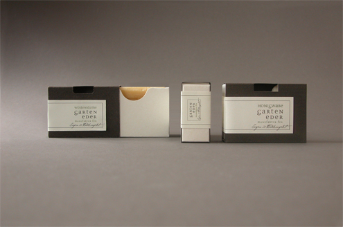

The functional and valuable packaging for handmade soaps clearly stands out from existing solutions on the market. It establishes a strong link to the region and philosophy of the product.
Graphic:
Siegmund Motter ( Motter Design )
Packaging design:
Herwig Bischof ( b.packaging )
Ben's packaging for sporting goods
 Be
Be n's is a company based in Vorarlberg that has made a name for itself in the field of American sports - far beyond the country's borders. Our brief was to pay tribute to this high profile and the quality awareness of the owners of Ben's in terms of shipping packaging and to give it a face. The idea behind this was to pick up an element of American sports to create recognition and to establish a connection to American sports. This was quickly found: the string, because: Balls, equipment, shoes, everything is laced in American sports.
Packaging design:
Herwig Bischof ( b.packaging )
Zur Gams - Chocolate wrapper writable
 Design and construction of a chocolate packaging for the gift market. A simple punched hole, which also serves as a window, makes it possible to fix a chalk inside the packaging. The inherent tension of the cardboard holds the chalk optimally and also makes it easy to remove.
Packaging design:
Herwig Bischof ( b.packaging )
bikapack kg Packaging for yoghurt cups
 Design and construction of a wide range of closure and design variants for yoghurt pot packaging.
Packaging design:
Herwig Bischof ( b.packaging )
Egg Brewery - Beer Carrier

Design of a beverage package for easy manual filling at the filling line and removal by the end consumer.
Packaging design:
Herwig Bischof ( b.packaging )
Sutterlüty - Bag in Box

Concept and functional optimisation of an existing beverage packaging for fruit juice. The additional side flap allows a foot to be folded out of the base in order to position the packaging at an angle. This allows easy emptying down to the last drop.
POS Design:
Herwig Bischof ( b.packaging )
Vinoble Cosmetics Gift Box

Design and construction of an exclusive packaging for cosmetic products. The functional solution with a separate insert allows the customer to package a wide variety of products for different occasions.
Packaging design:
John Gautier
Herwig Bishop